
The Urban Institute, a non-partisan think tank has published a new interactive map that shows poverty density in the U.S., as well as the race of the impoverished.
The new map, “Poverty and Race in America: Then and Now,” allows the map reader to examine poverty growth through race since the 1980s. It seems to show that Hispanic poverty, as well as all poverty in general, has ballooned since the 1980s and continues to grow. Overall, poverty is concentrated in the cities with minorities, though there has been growth in white poverty over time. Since it’s just a map, it can not explain why the poverty is growing. Instead, it can show us where poverty is geographically located in the country, and give us ideas for curbing and dealing with it in our communities
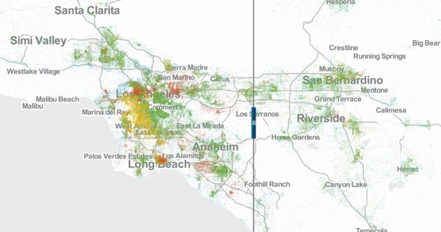
The map is a dot-distribution map, using colored dots placed on a location to correspond with a number. One dot on the map represents twenty people of that race below the poverty line. These kinds of maps are ideal for showing how dense something is distributed. While one green dot might not be much to look at, swathes of dots raise eyebrows and draw attention. The data used in plotting the map is drawn from the institute’s analysis of Census data from 1980 through 2000, as well as data from the 2007 – 2011 American Community Survey.
The way the map works is simple: a slider is placed between the center of the map which can be moved either to the left or the right. The reader can select from a drop-down menu at the top of the page what years they want to view, allowing them to compare decades further, or closer, apart. The reader is able to zoom in or out to whatever scale they want of the country with the mouse wheel, or by clicking on the map’s plus and minus signs on the left. The map defaults to Kansas City, Missouri, but can be centered anywhere in the country with use of the drop-down menu or simply dragging and clicking to the place you’re interested in examining.
Starting at the default view, which is of the lower 48 states and centered on Kansas City, Missouri, with the left set to 1980 and the right set to 2010, a quick pan of the slider across the map to the right places the country in the 1980s. Poverty at this scale seems to be a largely urban phenomenon, limited (but not restricted) to big cities, mostly made up of minorities. Whites in poverty exist in the cities, but mostly seem to stay to be a suburban and rural phenomena except for oddities like Scranton and Wilkes-Barre Pennsylvania (these are eastern Pennsylvania coal communities which were losing jobs at the time). Overall, though, white poverty seems to be minimal at best.
By sliding the slider over, we see that this is no-longer as true. White poverty has increased a bit, but the largely white areas like Scranton and Wilkes-Barre mentioned earlier are also gaining a minority population, which is in poverty.
Back to the 1980s, though. There is an interesting situation along the U.S. – Mexico border taking place in Texas at this time according to the map. There is a huge concentration of green dots near Juarez, as well as the area of Reynosa along the Gulf Coast. There is an impoverished white population, but the majority is overwhelmingly Hispanic. The dots continue to get denser if one changes the year to 1990, 2000, or 2010. The same thing occurs around San Diego, California, which is on the border with Tijuana, Mexico, as well as Phoenix and Tucson Arizona.
Due to the proximity to the U.S.-Mexican border, some might infer that these populations are undocumented immigrants. Even if they are, though, they do not account for all Latino poverty in the nation. Latino poverty, along with poverty of all minority groups, has swelled in the decades since the 1980s, though for some groups more so in specific areas. According to the map, New York City’s boom in poverty is in the Asian/Pacific Islander community, particularly where Chinatown is and where satellite Chinatowns are sprouting up, to some degree due to immigrants.
This map tells an interesting story of poverty in the country, however it does not explain all of America’s poverty. From the map we can not learn if this poverty is just moving around the country, brought in by immigrants, or if more people are simply falling into poverty because of declining standards of living. What it does allow us to do is find out where poverty is, its race, and draw up ideas on how to help curb it.
More information about the map can be read here.
Elaine Rita Mendus is a undergraduate student working on graduating college (someday soon). Her career interests include geopolitics, the Hispanic community, and urban planning. She really wouldn't mind ending up a scriptwriter though...
